Conception: Design System & User Experience
- Product Design
- User Experience Architecture
- Scalable Design System
- Interaction & Motion Design
Industry
saas
Team
1 member
Launched
2025
Country
India
About the Project
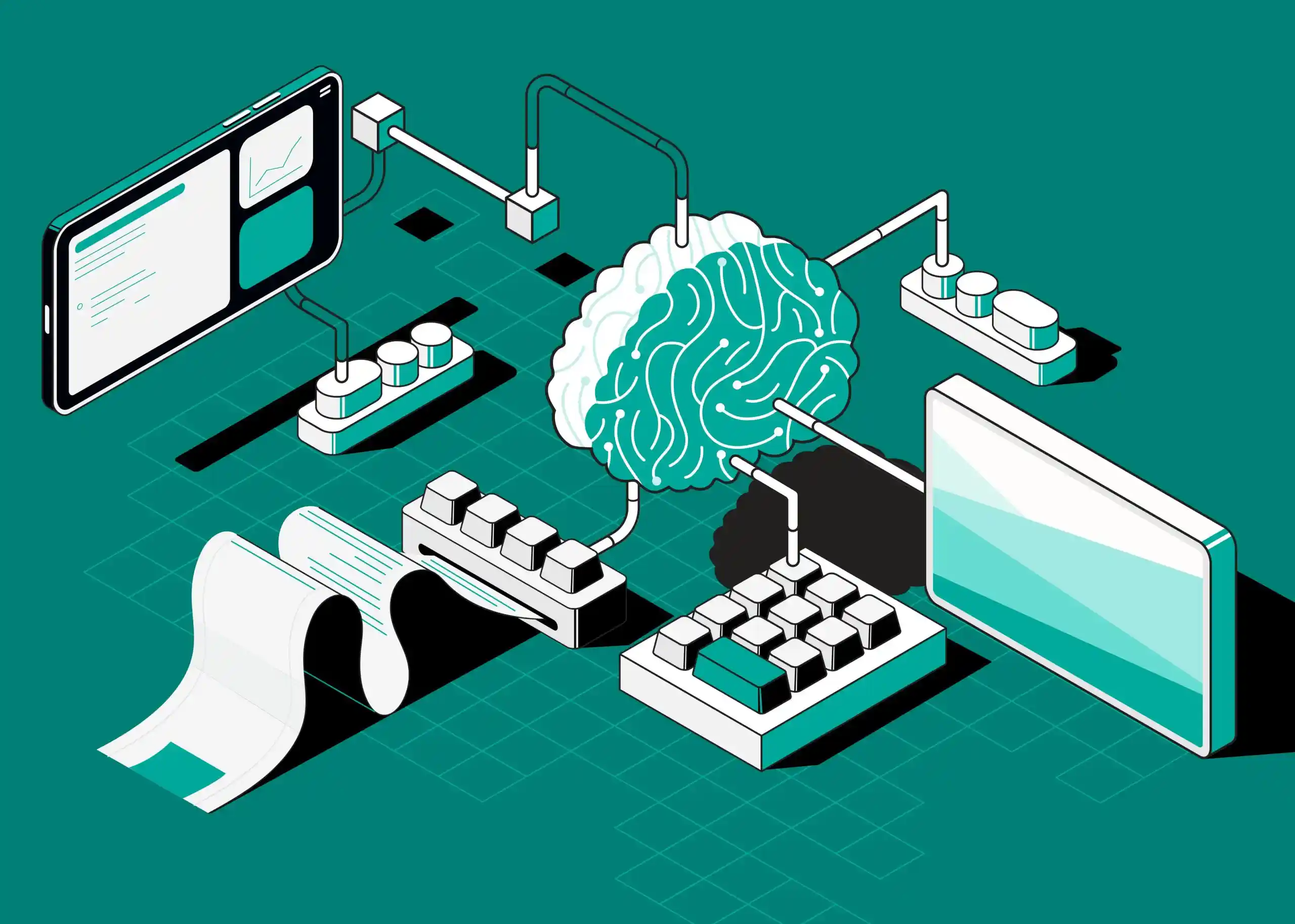
Conception was designed to rethink how knowledge workers experience AI inside their daily workflow. Instead of separating chat, documents, and organization into disconnected tools, the interface brings them together into a cohesive spatial system where conversations, pages, folders, and tags coexist within a single navigational hierarchy.
The design challenge was not simply aesthetic, it required crafting an experience where AI feels native to the workspace. Every interaction, from citation-backed responses to inline writing commands, had to feel immediate, contextual, and distraction-free. The interface needed to balance technical sophistication with clarity, enabling deep focus while supporting complex, multi-threaded thinking.
From a design and UX perspective, the product needed to:
- Establish a dark-first visual system optimized for long-form research and sustained focus
- Design a scalable component system supporting a stacked tab interface (up to 25 concurrent views)
- Unify chats and documents within a single sidebar tree to eliminate context switching
- Embed AI interactions directly inside the writing flow rather than isolating them in separate panels
- Visualize relationships through an interactive knowledge graph without overwhelming the user
- Maintain visual clarity and performance consistency across state-heavy, real-time interactions
The result is a modular, highly structured design system that supports rapid feature expansion while preserving visual consistency. Conception’s interface prioritizes hierarchy, motion restraint, and cognitive flow, transforming AI from a tool users visit into a layer that quietly augments how they think, research, and create.
The Challenge
- Design a unified product experience that seamlessly merges AI conversations, structured document editing, and interactive knowledge graph exploration within a single spatial system
- Craft a visual identity that positions Conception as a serious intellectual workspace, distinct from playful consumer note apps and generic AI chat tools
- Solve the complexity of supporting up to 25 simultaneous tabs without introducing visual clutter or cognitive overload
- Engineer a keyboard-first interaction model for power users while preserving clarity and discoverability for pointer-based interactions
- Create a dark-first interface optimized for long research sessions, balancing reduced eye strain with strict WCAG accessibility standards
- Establish a scalable design system capable of evolving from MVP to multiple major releases without fragmenting the visual language
Our Approach
- Performed cross-industry competitive analysis across AI platforms, advanced note-taking tools, and developer products to extract patterns suited for high-agency, power-user workflows
- Introduced a stacked-tab interaction model inspired by physical card systems, allowing multiple open contexts to be layered and navigated fluidly
- Reimagined traditional app architecture by unifying chats and documents within a single hierarchical sidebar tree
- Developed a dark-mode design language with calibrated contrast, subtle elevation, and restrained gradients to create depth without visual noise
- Built a robust Figma component system with scalable variants covering all interaction states across navigation, inputs, content blocks, and feedback elements
- Mapped and iterated on detailed user flows, from onboarding to deep research workflows, systematically removing friction at every stage
The Results
- Delivered a cohesive, production-ready design system comprising 120+ reusable components that supported 8 major product releases
- Established distinctive interface patterns, including stacked tabs, unified navigation, and inline AI commands, that clearly differentiate the product in the AI workspace category
- Achieved WCAG AA accessibility compliance within a dark-mode-first framework through precise contrast and focus-state calibration
- Designed a comprehensive shortcut ecosystem covering 30+ actions, supported by an in-app command palette for rapid discoverability
- Reduced time-to-first-value to under two minutes from signup to first successful AI interaction
- Created design documentation and principles that enabled consistent execution across the web app, marketing site, and future product expansions
Design & UX Challenges
Designing an AI-native knowledge workspace required resolving deep interaction complexity while maintaining clarity, accessibility, and a calm intellectual brand presence.
Translate technically complex capabilities, citation-backed AI responses, dynamic knowledge graphs, and stacked multi-tab navigation, into intuitive, self-explanatory interface patterns through progressive disclosure
Design pricing-tier differentiation (Basic / Pro / Premium) that preserves trust with free users while clearly articulating functional and experiential upgrade value
Reduce cognitive overload when supporting up to 25 simultaneous tabs, ensuring spatial awareness and navigational confidence without visual clutter
Develop a dark-first interface system that meets WCAG AA accessibility standards through calibrated contrast, focus states, and semantic color usage
Implement a keyboard-first interaction framework for power users while maintaining full usability and discoverability for pointer-based workflows
Craft empty, loading, and error states that reinforce the product’s calm, focused personality instead of disrupting user flow
Balance AI-driven automation (inline writing commands, auto-generated graphs, real-time search) with user control, transparency, and predictable system behavior

Product Essentials
Core systems and interaction modules that define the AI-native workspace experience
Frictionless Onboarding
The onboarding experience was intentionally designed to feel immediate and lightweight. Users authenticate via Google and are dropped directly into a clean workspace, eliminating unnecessary setup steps and reducing friction.
The first interaction centers around a clear empty state prompt encouraging users to ask a question. Contextual tooltips progressively introduce the sidebar tree, stacked tabs, command palette, and inline AI commands without overwhelming the user.
This progressive disclosure model ensures that power features remain discoverable while preserving clarity for first-time users.

Design Process
Research & Competitive Analysis
Market Research We analyzed three product categories: AI chat platforms (ChatGPT, Claude, Perplexity), note-taking apps (Notion, Obsidian, Roam Research), and developer tools (VS Code, Linear, GitHub). This cross-category analysis revealed design patterns that work for power users: keyboard-first navigation, command palettes, customizable layouts, and dark mode defaults.
User Persona Development Through stakeholder interviews and user research, we identified three core personas: The Researcher (academic, needs citation management), The Writer (content creator, needs AI writing assistance), and The Knowledge Worker (professional, needs organizational systems). Each persona informed specific design decisions researchers need graph view, writers need inline AI commands, knowledge workers need powerful search.
Friction Point Mapping We mapped common friction points in existing tools: ChatGPT loses conversation history in long threads, Notion AI requires too many clicks to invoke commands, Obsidian graph view is overwhelming without filters. These insights shaped our core UX decisions stacked tabs for context persistence, inline slash commands for quick AI access, filterable graph view for usability.


Information Architecture & User Flows
Spatial Model Design We designed Conception's spatial model around a unified sidebar tree the primary navigation structure. Unlike typical apps that separate 'notes' and 'chats,' we made both first-class content items that coexist in the same hierarchy. This decision was controversial (diverges from user expectations) but ultimately successful users reported that it 'just makes sense' once they tried it.
User Flow Mapping We mapped five critical user flows: (1) Onboarding: Google sign-in → empty workspace → first AI query. (2) Research: AI question → cited answer → save to page → organize in folder. (3) Writing: Create page → add blocks → invoke AI commands → refine text. (4) Organization: Create folders → drag items → add tags → filter by tag. (5) Exploration: Open graph view → discover connections → click node → navigate to content.
Keyboard Shortcut Architecture We designed a comprehensive keyboard shortcut system covering 30+ actions, organized by context: Global shortcuts (Cmd+K search, Cmd+N new page, Cmd+/ command palette), Navigation (Cmd+1-9 tab switching, arrow keys tree traversal), Editor (Cmd+B bold, Cmd+I italic, / for AI commands), and Tab management (Cmd+[ and Cmd+] for prev/next). All shortcuts are discoverable via Cmd+? help panel.
Visual Design & Brand Identity
Dark Mode First We committed to dark mode as the default and only theme. This decision was driven by three factors: (1) Target users spend hours in the app dark mode reduces eye strain, (2) Dark UI creates a focused, professional aesthetic aligned with brand positioning, (3) Single theme simplified design and development velocity. We ensured WCAG AA compliance through careful contrast ratio calibration: 4.5:1 for body text, 3:1 for large text.
Component Design Language We established design patterns for all major components: Buttons use rounded corners (8px radius) with solid fills for primary actions, outlined style for secondary. Cards have subtle shadows (0 2px 8px rgba(0,0,0,0.1)) and hover effects (slight elevation increase). Inputs have clear focus states with blue accent borders. Modals use backdrop blur and center positioning with smooth fade animations.
Iconography System We created a custom icon set with 50+ icons covering all UI needs: content types (page, chat, tag, folder), actions (add, delete, edit, search), AI features (citation, command, graph), and navigation (sidebar, tabs, graph view). Icons use 24px base size, 2px stroke width, and rounded stroke caps for visual consistency. Icons are monochrome (inherit text color) for flexibility across contexts.


Prototyping & Interaction Design
Stacked Tab Prototype The stacked tab concept required multiple prototyping iterations. We built interactive Figma prototypes exploring different visual metaphors: overlapping cards, vertical sidebar list, horizontal tab bar with overflow. The winning design used horizontal tabs with visual stacking (tabs appear layered) and sliding animations between tabs. We prototyped the interaction timing (300ms transition) and easing curve (ease-in-out) to achieve smooth, satisfying navigation.
AI Command Flow We prototyped the inline AI command experience extensively. Early versions used a modal dialog for command selection, but this broke writing flow. We iterated toward slash commands (/) with inline menu, inspired by Notion and Linear. The menu appears at cursor position, filters as user types, and shows daily quota for each command. After command selection, AI response streams with typing animation (60ms per token) to create anticipation and show AI thinking process.
Graph View Interaction Graph view interaction design required careful attention to performance and usability. We prototyped zoom/pan controls with mouse wheel (zoom) and click-drag (pan). Node hover shows tooltip with title and type. Click selects node and highlights direct connections (fading unrelated nodes). Double-click opens content item. Right-click shows context menu (open in new tab, delete, add tag). Filter toggles in top-right corner allow hiding/showing content types with smooth fade animations.
Design System & Component Library
Figma Component Library We built a comprehensive Figma component library with 120+ components organized into categories: Foundations (colors, typography, spacing, icons), Atoms (buttons, inputs, badges, tooltips), Molecules (cards, list items, navigation items), Organisms (sidebar, tab bar, command palette, modals), and Templates (page layouts, empty states, error states). Each component includes variants for all states (default, hover, active, focus, disabled) and documentation annotations.
Documentation & Guidelines We created design system documentation covering: (1) Design principles (intellectual minimalism, keyboard-first, unified complexity), (2) Component usage guidelines (when to use buttons vs links, modal vs inline actions), (3) Accessibility requirements (contrast ratios, focus indicators, keyboard navigation), (4) Motion design specs (transition timing, easing curves), (5) Voice and tone guidelines (concise, intellectual, not playful).
Developer Handoff We established a smooth design-to-development handoff process: Figma designs are organized to mirror code structure (components → pages → flows). Designs include redline specs for spacing, sizing, and responsive behavior. Interactive prototypes demonstrate complex animations and transitions. Design tokens (colors, spacing, typography) are exported as JSON and imported into Tailwind config. Weekly design reviews ensure implementation fidelity.


User Testing & Iteration
Usability Testing We conducted moderated usability testing with 12 participants across our three personas (researchers, writers, knowledge workers). Key findings: (1) Users loved the keyboard shortcuts but didn't discover them we added command palette and help panel, (2) Stacked tabs were confusing initially but users 'got it' after 5 minutes we added onboarding tooltip, (3) Graph view was overwhelming we added filters and focus mode, (4) AI command slash menu wasn't discoverable we added persistent hint in editor placeholder.
A/B Testing Key Interactions We A/B tested several contentious design decisions: (1) Sidebar position: left vs right → left won (familiar pattern), (2) Tab bar position: top vs bottom → top won (proximity to content), (3) Citation presentation: inline markers vs side panel → inline markers won (less disruptive), (4) AI command trigger: slash vs Cmd+K → slash won (more discoverable, Cmd+K reserved for global search).
Accessibility Audit We conducted comprehensive accessibility audits covering: (1) Color contrast: all text meets WCAG AA ratios (4.5:1 for body, 3:1 for large text), (2) Keyboard navigation: all interactive elements are keyboard-accessible with visible focus indicators, (3) Screen reader: semantic HTML structure with proper ARIA labels for all interactive elements, (4) Motion sensitivity: animations respect prefers-reduced-motion preference. Achieved WCAG AA compliance across the entire application.
Before & After: Key Design Decisions
Dark Mode vs Light Mode System
The interface was designed with a dark-first philosophy and later translated into a carefully calibrated light theme. Both modes share the same structural hierarchy, spacing system, and component logic only the visual tokens and elevation strategies adapt between themes.


Stacked Tab Interaction
Early designs relied on a basic browser-style tab bar that felt cluttered beyond 5 open items. The redesigned stacked tab system introduced a visual layering metaphor tabs appear physically stacked giving users spatial awareness of up to 25 concurrent contexts without visual overload.


Ready to bring your idea to life?
Partner with us to design and build your next product. Start by sharing your vision or booking a free consultation.
Contact usUI Architecture & Design System Foundations
Explore the core features that make this product stand out.
Experimental Stacked Tabs Layout
A signature navigation pattern designed as a spatial system rather than a traditional tab bar. The stacked tabs introduce a layered card metaphor, allowing up to 25 open contexts while preserving visual hierarchy. The interaction balances density with clarity through controlled motion, progressive visibility, and color-coded content types. This experimental layout became a defining brand element, blending productivity-tool rigor with a distinctive visual identity.
Unified Information Architecture
Instead of separating chat and documents into siloed sections, the interface was architected around a single hierarchical tree. This decision redefined the product’s mental model, positioning conversations and pages as equal knowledge artifacts. The sidebar system was designed with scalable indentation logic, consistent iconography, and adaptable interaction states to support long-term extensibility.
Scalable Component System
A comprehensive design system built to scale from MVP through multiple major releases. Components were structured with reusable variants and state logic (default, hover, active, focus, disabled), ensuring visual consistency across complex interaction scenarios. The system includes navigation primitives, input fields, overlays, feedback states, and content modules, all governed by shared spacing, radius, and typography tokens.
Dark-First Visual Identity
The brand identity was expressed through a dark-first interface crafted for sustained focus and cognitive calm. Rather than relying on heavy gradients or visual noise, depth was created through contrast calibration, subtle elevation, and restrained accent usage. The color system balances accessibility (WCAG AA compliance) with a sophisticated, intellectual tone aligned with the product’s positioning.
Embedded AI Interaction Design
AI functionality was designed as a native layer of the interface rather than an external utility. Inline command menus, contextual triggers, and streaming response states were crafted to feel like natural extensions of the editing experience. This required designing new interaction patterns that blend automation with user control, ensuring clarity, predictability, and transparency.
Motion & Microinteraction Framework
A restrained motion system reinforces spatial awareness without distraction. Sliding tab transitions, subtle fades, hover elevations, and streaming feedback animations follow consistent timing curves to maintain continuity. Motion was treated as a structural tool, guiding attention, clarifying hierarchy, and supporting the product’s calm, deliberate personality.
Knowledge Visualization Design
The interactive graph view was approached as both a functional visualization and a branded experience. Node color logic, scaling rules, and edge relationships were designed to communicate structure without overwhelming the user. Filters and focus states ensure the visualization adapts to user intent, maintaining clarity even as knowledge complexity increases.
Design System Governance & Scalability
Beyond components, the system was documented with design principles, usage guidelines, and scalable patterns to ensure long-term cohesion. The modular foundation allows new features, pricing tiers, and future platforms to integrate seamlessly without fragmenting the visual language.
Design Impact & Outcomes
The Conception design system demonstrates how complex, AI-native functionality can be distilled into a cohesive and intuitive interface. By systemizing components, codifying interaction patterns, and establishing a disciplined dark-first visual identity, the product maintains clarity even as feature depth expands. Signature patterns such as stacked tabs, unified navigation, and embedded AI commands differentiate the experience while serving functional intent. The result is a scalable design foundation that evolves confidently across releases, balancing power-user performance with approachability, and innovation with structural consistency.
120+
Systemized Components
Modular, reusable components powering a scalable Figma design library
30+
Shortcut Actions
Keyboard-first interaction framework enabling high-efficiency workflows
<2 min
Time to First Value
Streamlined onboarding from signup to first successful AI interaction
8+
Major Releases
Design system sustained visual and interaction consistency across versions
Related Projects
Explore more projects we've delivered with similar technologies and expertise.

 Indiasaas
Conception: AI Workspace Website
Key highlights from this project:
- Next.js
- React
- TypeScript
- Web Design
A high-performance Next.js website that drove user adoption for an AI-powered knowledge management platform through compelling storytelling and seamless user experience.
Explore more Indiasaas
Conception: AI-Powered Knowledge Web App
Key highlights from this project:
- Web Application
- AI Integration
- Real-time
- Knowledge Management
A sophisticated web application combining real-time AI chat, intelligent document management, and visual knowledge mapping built to handle 25 simultaneous tabs, citation-backed AI search, and complex graph visualizations.
Explore moreExplore our full portfolio of work. View all projects
Whether you need a custom application, AI integration, or a complete digital transformation, our team has the expertise to bring your vision to life.
Ready to transform your vision into reality? Our expert team is here to help you build cutting-edge solutions tailored to your business needs.
Ready to Build Something Amazing?
Start a projectIndustry Insights
Explore our latest thinking on industry trends, technology innovations, and digital transformation strategies.

Vertical SaaS: Why Industry-Specific Software Is Winning in 2026
Vertical SaaS is growing 18-22% a year while horizontal platforms lag at 12-15%. This guide breaks down why industry-specific software wins - deeper switching costs, up to 8x lower CAC, compliance moats, embedded fintech that lifts revenue per customer 2-5x, and AI built on proprietary industry data - plus how to decide if going vertical is right for your product and how to architect it.
Building AI Agents for SaaS: The 2026 Guide
Over half of enterprises have AI agents in production, yet 88% of agent projects never ship. This is the 2026 playbook we use to design, build, and deploy production-grade AI agents for SaaS - covering architecture patterns, frameworks, multi-tenancy, cost control, evaluation, and monetization, with code samples and real production numbers.
How to Add AI Features to Your Existing SaaS Product
You don’t need to rebuild your SaaS to ship AI. The teams that win start with one high-impact use case, lean on APIs to move fast, and build a data flywheel for a long-term moat. This guide is the exact framework we use to pick, prioritize, architect, and ship AI features customers actually pay for.
Frequently Asked Questions
Timeline varies based on scope and complexity. A focused MVP typically takes 3-4 months, while a comprehensive platform could require 6-12 months or more. We provide detailed timeline estimates after understanding your specific requirements, and our agile approach ensures you see working software early and often.
We follow industry best practices including code reviews, automated testing, CI/CD pipelines, and regular QA cycles. Our teams use test-driven development where appropriate and maintain comprehensive test coverage. We also conduct security audits and performance testing before every major release.
Our expertise spans modern web and mobile technologies including React, Next.js, Flutter, Node.js, Python, and cloud platforms like AWS, GCP, and Azure. We also have deep experience with AI/ML frameworks, blockchain, and IoT. We choose the best technology stack based on your project requirements.
Yes, we offer comprehensive post-launch support and maintenance packages. This includes bug fixes, performance monitoring, security updates, and feature enhancements. Our support team is available to ensure your application runs smoothly and continues to evolve with your business needs.
We maintain transparent communication through regular standups, sprint reviews, and dedicated project channels on Slack or Teams. You'll have direct access to your development team and a dedicated project manager who provides weekly progress reports and handles any concerns promptly.
Start growing your business with us
Tell us about your project and we'll get back to you within 24 hours.