

Most SaaS landing pages aren’t built to convert new sign-ups-they just sort of sit there, showing off features. The numbers back this up: the typical SaaS landing page squeaks by with a 3.8% conversion rate, which is the lowest of any industry researchers track. Top-performing pages? They climb to 11.6% or more. That’s not just a fluke; it’s the difference between a site that quietly lists what it does and one that really guides visitors toward saying “yes.”
We’ve helped shape landing pages for all kinds of SaaS products-fresh MVPs testing the waters, big players spending six figures a month on ads, everything in between. Honestly, the pattern is always the same: the best converters aren’t the prettiest sites or those full of clever catchphrases. The winners are the ones where every inch of the page works toward the same goal, grounded in a solid understanding of what really gets people to sign up.
So, this guide will break down exactly what separates high-performing SaaS landing pages from the rest. No vague theory-just the specific pieces you can actually use, supported by data and psychology, to see how your own pages measure up.
Why Most SaaS Landing Pages Miss the Mark (And Why That’s a Good Thing for You)
SaaS brings its own set of hurdles that other industries simply don’t. Think about it: nobody impulse-buys a project management tool the way they might for a pair of new shoes. They’ve got to think about their team, onboarding, budgets, maybe even get buy-in from four or five other people.
That longer, messier decision process drags down conversion rates. But here’s the upside: get even a little bit better, and the payoff’s huge. If you bump your conversion from 3.8% to 7.6%-which still isn’t even “top quartile”-you double your sign-ups. For companies paying $100 per click in the crowded SaaS world, that’s massive. That isn’t fine-tuning. It’s the line between a winning acquisition strategy and burning cash for nothing.
The classic mistakes we see over and over:
- Focusing on features - leading with what the tool does, not what it helps someone achieve. At the end of the day, nobody cares about your collaboration engine; they just want to ship projects faster.
- Aiming for just one type of person - most SaaS purchases get the green light from a group, not a solo user. If you don’t relate to the buyer, the IT guy, or the person holding the purse strings, you lose.
- Jamming too many calls-to-action onto the page - Free Trial, Book a Demo, Watch a Video, Download Whitepaper, all at once. The result? No one chooses anything.
- Failing to build trust - SaaS isn’t something customers can see or touch. If you don’t bring in strong proof or credibility right away, most visitors default to “no thanks.”
Get these right and you’re already ahead. Let’s talk about what drives results.
Stuck below the 3.8% SaaS conversion benchmark?
We’ve audited and rebuilt landing pages for SaaS founders running ads, content engines, and product-led growth - the kind where every percentage point on conversion rate compounds into months of runway.
Book a free landing page audit and we’ll walk through your hero, social proof, CTA flow, and performance to flag the highest-impact fixes.
Nailing the Hero Section: You’ve Got 5 Seconds
Visitors spend more than half their time looking at the hero section-the part of your page that’s visible before you scroll. If you miss here, nothing else matters, because most people don’t stick around to see the rest.
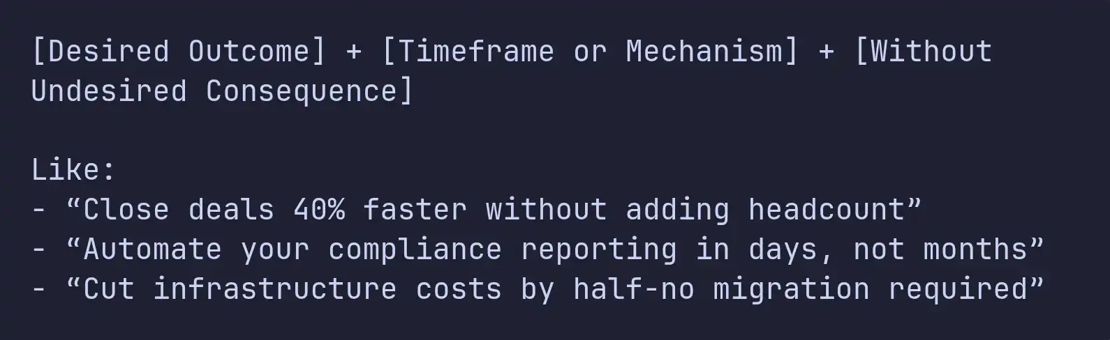
The Headline
Your headline needs to do one thing: convince the visitor that spending even 30 more seconds reading is worth it.
Great SaaS headlines usually do three things:
- Focus on the outcome, not just what the product does. “Ship code 3x faster with automated reviews” sticks; “AI-powered code review platform” falls flat.
- Be specific. Skip the fuzzy promises. “Reduce churn by 25%” trumps “Improve retention.”
- Use language that’s easy to read - 5th to 7th grade works, and it isn’t about dumbing things down. It’s about being clear.
We tend to test three to five headlines right away for every SaaS client. Flashy or clever doesn’t win-it’s the one that nails the visitor’s real question: “Is this for me, and does it fix my problem?”
Quick framework for a headline:
The Subheadline
This is where you build on the headline and get concrete. If the headline tells them what’s in it for them, the subheadline tells them how, or who it’s really for.
A good approach: Use the subheadline to call out the audience and add credibility.
Example:
Headline: Ship features your users actually want. Subheadline: Product teams at 400+ SaaS companies use [Product] to prioritize their roadmap using real usage data-not just gut feeling.
See what that does? It says who should care (product teams), how many already trust it (400+), and the unique factor (based on data).
The All-Important CTA
Above the fold, stick with one call to action. Seriously: one. Not “maybe sign up,” “take the tour,” and “read more,” all together.
Also, make it clear what happens when they click. “Start my free trial” works better than “Submit.” “See it in action” beats “Learn more.” Simple, but it always makes a difference.
Make the button pop-high contrast, easy to find, big enough you can’t miss it. Right underneath? Add something that lowers the resistance: “No credit card required,” “Free for up to 5 users,” “Set up in under 2 minutes.” That little reassurance matters.
The Hero Visual
SaaS is abstract, which is a problem for a landing page. A dashboard screenshot by itself usually just confuses people. The best visuals fall into one of three buckets:
- Product in context - show your solution being used, with data that makes sense, inside a browser. Don’t just drop in a blank slate.
- Interactive demos - embedded tours or clickable previews are becoming standard on top SaaS pages. People want to try before they commit.
- Show outcomes - a split-screen before-and-after, or something that makes the transformation obvious (messy spreadsheet to polished dashboard, that sort of thing).
Whatever you do, avoid the tired stock photos of people grinning at laptops. They blend in with every other forgettable SaaS site, and nobody pays attention anymore.
Social Proof: The Trust Architecture
Social proof isn’t just a box you check off. It’s the backbone of trust on your site, woven through every part of the experience. When I’ve helped build SaaS products, I’ve seen firsthand that where you place social proof is just as important as what you show.
Logo Bars
Drop a row of logos from recognizable customers right below your hero section. These logos don’t just fill space-they quickly answer an unspoken question: “Is this product for real?”
But just tossing up a batch of random logos doesn’t cut it anymore. What really works? Give those logos some context. “Trusted by 2,000+ teams” is fine, but “Trusted by engineering teams at Stripe, Notion, and Linear” is way stronger. The more specific you can get-named logos, actual results-the more believable your proof becomes.
Testimonials That Convert
Let’s be honest: most SaaS testimonials are pretty useless. “Great product, really improved our workflow!” Nobody learns anything from that. The testimonials that actually convert people have three things in common:
• Get specific about results: “We cut onboarding from 3 weeks to 4 days after using [Product].” • Be clear about who’s talking: Mention their title and company so other prospects can see themselves in the story. A VP of Engineering speaks right to other engineering folks. • Tackle objections directly: “We worried about switching from [Competitor], but the import tool handled 50,000 records with zero issues.”
Drop these right where people hesitate-next to your call to action, after pricing (when sticker shock hits), and right near feature claims that could use a second opinion.
Quantified Results
People trust numbers over adjectives. Make your page do some heavy lifting with a metrics bar like this:
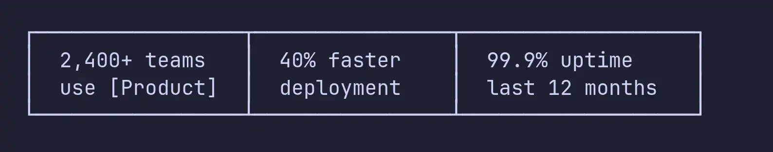
Just make sure your numbers mean something to your target buyer. “40% faster deployment” speaks to business results. “500 million API calls processed” only matters if your buyer really cares about infrastructure scale.
Trust Signals Near the CTA
Security badges, SOC 2 or HIPAA seals, privacy reassurances-all these things calm nerves at the critical moment. I always put these trust markers right by every big CTA-never buried in a footer nobody visits.
Not sure where to place social proof on your page?
Most SaaS pages either bury their best testimonials in a carousel at the bottom or front-load logos that don’t match the buyer. Placement is everything - and it’s the cheapest conversion lift you can ship this quarter.
Book a free landing page review and we’ll map where your trust signals belong: hero, near pricing, next to the CTA, and around your most skeptical claims.
The Value Proposition: Features, Benefits, Outcomes
Almost every SaaS landing page lists features. Most of them fall flat because they stop at the feature, instead of connecting it to the user’s real goals.
Feature → Benefit → Outcome
There are three levels of communication, and each is progressively more persuasive:
| Level | Example | Persuasion Power |
|---|---|---|
| Feature | "Real-time collaboration" | Low - describes the product |
| Benefit | "Your team works together without version conflicts" | Medium - describes the user experience |
| Outcome | "Ship features 40% faster because no one's waiting on handoffs" | High - describes the business result |
High-converting pages lead with outcomes, support with benefits, and use features as proof. The structure for each value block should follow this pattern:
Outcome headline → Benefit explanation (2-3 sentences) → Feature detail → Supporting visual or screenshot
How Many Sections? Go with Three
We’ve tested it, and three core value props always beat five, seven, or ten. That’s not random; it’s how people’s brains work. Jamming in more than a few strong messages just ends up overwhelming visitors-they skim, and your message gets lost.
Find the three things your ideal customers really care about. Give each one its own space, clear heading, short explanation, and visual. All your other features? Put them on a separate features page, out of the main flow.
Getting Visual Hierarchy Right
Each value section should use an F-pattern or Z-pattern layout.
- Use an F pattern for text-heavy areas-people scan the left, then jump across the top lines.
- Use a Z pattern when you have a mix of text and images-eyes zigzag from top left to top right, then down and across.
Switch up your layout between sections (sometimes image left, sometimes image right). This keeps the rhythm fresh and keeps visitors scrolling all the way down.
Pricing Preview: Reduce Friction, Not Revenue
Should you put pricing on your SaaS landing page? People argue about this all the time. After working on pages for products priced anywhere from $29/month to $50,000/year, here’s what we’ve found: unless your typical deal is over $25,000/year, just show your pricing.
For self-serve and low-touch SaaS, hiding pricing is basically adding an obstacle. When visitors can’t find numbers, they start thinking either “this is way too expensive” or “these folks just want to trap me into a sales call.” Neither of those thoughts builds trust.
How to actually display pricing so it works for you? A few key moves:
- Use three pricing tiers: Good/Better/Best. This lets people pick where they fit and makes your middle tier look like the obvious choice.
- Put the spotlight on your preferred plan. Make it stand out visually-color, size, “Most Popular” badge.
- Default to annual pricing. Show monthly as an option, but anchor the conversation with a lower per-month amount.
- For big enterprise deals, include a “Talk to Us” tier. That way the high-value prospects aren't lost, but your self-serve flow stays uncluttered.
If your product hits different segments-say, startups and big companies-think about personalization. For instance, companies with 500+ employees (which you can spot via IP lookup or enrichment tools) see pricing tailored for enterprise buyers, while everyone else gets your standard self-serve plans.
(Pricing is also one of the most common leaks we see post-signup. If you’re refining tiers or anchoring, our SaaS Revenue Leak Audit covers nine places SaaS companies bleed money - several of which start on the landing page itself.)
The CTA Strategy: Repetition Without Redundancy
Now let’s talk CTAs. One button isn’t enough on a long page, but dropping the same “Start Free Trial” CTA everywhere feels desperate. What you want is progressive commitment: change up the copy as people scroll, so it feels more like a conversation and less like a broken record.
Picture this CTA flow:
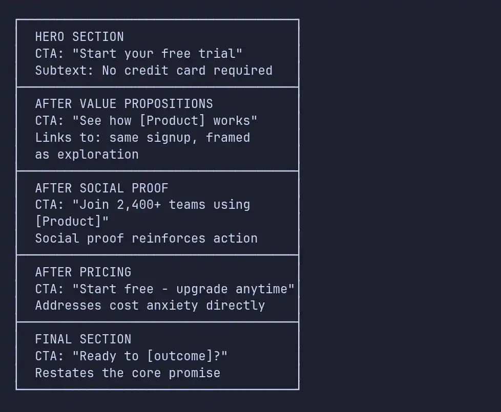
All these CTAs point to the same place-they just talk to the visitor differently depending on what section they’ve just read. After showing results? It’s about joining a crowd. After pricing? It’s about low risk. Feels natural, respects where they’re at mentally.
Secondary CTAs
One last thing: for B2B SaaS (where folks need buy-in from others), add a secondary CTA like “Book a Demo” or “Talk to Sales.” Make it low-key-a text link or outline button, nothing flashy. That keeps your main CTA in the spotlight and lets hesitant visitors raise their hand without confusing everybody.
Let’s not ignore page performance.
It’s invisible, but it’s deadly for conversions. Every extra 100 milliseconds your page takes to load, you lose about 1% of signups. One-second delay? You could drop 20% of conversions. And on mobile, if your site takes longer than 3 seconds, over half your visitors just bounce.
For SaaS, paid traffic is a big deal, so slow pages basically mean burning money.
Here’s what every SaaS landing page must have:
- Largest Contentful Paint under 2.5 seconds. That’s when the main stuff actually shows up. Compress images, use WebP/AVIF, lazy-load anything below the fold.
- First Input Delay under 100ms. Your page needs to react almost instantly. Hold back unnecessary JavaScript, especially analytics and chat widgets-they’re not worth slowing down the hero section.
- Cumulative Layout Shift under 0.1. Nothing kills trust quicker than stuff jumping around while loading. Set sizes for images and embeds. Load fonts with
font-display: swap, set fallback font metrics so the layout doesn’t reflow.
Example of what that looks like in your HTML:
<!-- Preload critical assets for hero section -->
<link rel="preload" as="image" href="/hero-screenshot.webp" />
<link rel="preload" as="font" href="/fonts/inter-var.woff2"
      type="font/woff2" crossorigin />

<!-- Defer non-critical scripts -->
<script defer src="/analytics.js"></script>
<script defer src="/chat-widget.js"></script>-
Serve everything static from a CDN, so your images, fonts, and scripts are close to users, wherever they are.
-
Inline above-the-fold CSS, Extract and inline the CSS needed to render the above-fold content. Load the rest asynchronously.
Look as of 2026, only about half the web (53% of sites as of 2026) actually nails all three Core Web Vitals. If you do, you’re ahead of most competitors-even the well-funded ones, whose bloated landing pages slow them down. That’s not just technical bragging-it’s a real advantage in the SaaS world.
Slow landing page eating into your paid traffic ROI?
If your LCP is over 2.5s or you’re hitting layout shift issues on mobile, every additional second is costing you 7-20% of signups - and it shows up first in your CAC, not your dashboard.
Book a free performance audit and we’ll benchmark your Core Web Vitals, pinpoint the worst offenders, and outline a fix plan you can ship in a sprint.
Common Mistakes That Tank Your Conversion Rates
After tearing apart and rebuilding tons of SaaS landing pages, these problems pop up again and again:
1. The Navigation Bar Trap
Landing pages aren’t just mini-websites. When you stuff them with links to your blog, about page, careers, and docs, you’re basically handing visitors seven ways to bail before they even see what you offer. High-converting landing pages ditch navigation altogether or keep it simple - just your logo (linked to the homepage) and a lonely CTA button.
Honestly, just removing navigation on paid landing pages has boosted conversion rates by 20-30% in our experience. When someone clicks an ad for a feature, don’t send them to your homepage with a buffet of links. Give them what they came for.
2. The Wall of Text
SaaS founders love their products, and it shows - way too much. They pile on dense paragraphs nobody reads. Your landing page isn’t a reference manual.
Keep paragraphs super short, toss in bullet points, and don’t be stingy with whitespace. These aren’t just design choices - they actually drive conversions. If your content is easy to scan, people find what matters to them, fast.
3. Generic Stock Photography
You know the photos: a grinning guy with a headset, a team huddled around a whiteboard, someone jabbing at a screen. These say nothing about your product and, honestly, make your page feel lazy. Visitors have seen them everywhere and immediately assume “low effort.”
Ditch the stock images. Use real screenshots of your product, custom illustrations, or short demo videos. If you really need photos, show your actual team or workspace - imperfect beats fake every time for building trust.
4. The “Everything Page”
Trying to speak to every possible visitor on one page never works. Startup founders and enterprise IT directors worry about totally different things. One page isn’t going to win over both.
The better move? Build pages for specific segments. Route people using UTM parameters or company info so they see the content that fits them. Custom landing pages usually convert three times better - 11.6% vs. 3.8% for generic pages.
5. Ignoring Mobile
Mobile pages load slow: an average of 8.6 seconds, which is way longer than desktop. And since mobile makes up half of all visits, if your page looks great on desktop but stinks on a phone, you’re throwing away a huge chunk of potential conversions.
It’s not just about making things “responsive.” Rework the layout for thumbs, cut out unnecessary form fields, add click-to-call for sales, and make sure anything clickable is big enough to tap easily (at least 48px).
Optimization Strategy: Test What Matters
A/B testing is crucial, but don’t waste traffic tweaking stuff that barely matters. The best SaaS teams run 2-3 tests each month and focus on what actually moves the needle. (The same prioritization logic applies to ecommerce CRO - if you’re curious how this translates downstream, our ecommerce cart optimization guide walks through the same impact-first thinking applied to checkout.)
What To Test First (Highest Impact)
- Headlines - This makes the biggest difference. Try outcome-focused versus feature-focused, use real numbers, and test formats like questions vs. statements.
- CTA copy and placement - Test detailed actions instead of vague ones, experiment with CTA location, and see if removing friction (“No credit card required”) helps.
- Social proof format - Try logo bars, testimonials, or hard numbers. Mess with placement: in the hero, mid-page, or right near your CTA.
- Page length - Sometimes short wins. Run a shorter version against your full page and see if trimming the fat helps or hurts.
What To Test Later (Lower Impact)
- Color and button styling - Despite all the hype, button color barely matters as long as there’s good contrast (minimum 4.5:1 for accessibility).
- Image variations - Screenshots, illustrations, videos - these take longer to show results because you need more traffic.
- Form fields - Every extra field costs you signups. Test shorter forms and see how much info you can ask for after signup instead of before.
Statistical Rigor
Make sure your tests hit 95% statistical significance with at least 100 conversions for every version. SaaS pages usually don’t get huge traffic, so expect a headline test to run for two to four weeks. Don’t call a winner early just because the numbers look good - jumping the gun leads to false positives and wastes your future cycles.
Set up analytics to track both micro-conversions (like scroll depth, CTA hovers, or seeing your pricing) and macro-conversions (signups, demo requests). This data guides your next test and helps you stay on track.
// Track meaningful scroll milestones, not just page views
const milestones = [25, 50, 75, 100];
const tracked = new Set();

const observer = new IntersectionObserver((entries) => {
  entries.forEach(entry => {
    if (entry.isIntersecting) {
      const depth = Math.round(
        (entry.target.offsetTop / document.body.scrollHeight) * 100
      );
      const milestone = milestones.find(m => m <= depth && !tracked.has(m));
      if (milestone) {
        tracked.add(milestone);
        analytics.track('scroll_depth', { percent: milestone });
      }
    }
  });
});

document.querySelectorAll('[data-scroll-marker]')
  .forEach(el => observer.observe(el));
Personalization: The 2026 Multiplier
Static landing pages that serve up the same content for everyone are basically leaving money on the table. In 2026, the landing pages that really work in SaaS are the ones that personalize everything, pulling whatever signals they can get.
-
Think about where someone came from. If they hit your site after searching “project management tool for agencies,” show them agency-friendly messaging, agency hero testimonials, and screenshots that actually look like something an agency would use. But if someone googled “project management for engineering teams,” give them a page that feels completely different.
-
Company size matters too. If reverse IP lookup shows you’re dealing with a small business, use language like “Get started in minutes, no IT team needed.” For enterprise folks, fire back with “SOC 2 certified, SSO-ready, dedicated success manager.” Make it feel like the page was designed just for them.
-
Visitors who come back aren’t in the same spot as first-timers. If someone’s visiting for the third time, chances are they don’t need an introduction. Step it up-show them comparisons, case studies, or a clear CTA to “Talk to our team” instead of an intro headline they’ve already read.
Don’t forget about where people are in the world. Show prices in their local currency. Mention compliance needs that actually affect them. Prove real companies near them use your product-because that’s what matters when they’re making a decision.
Here’s the thing-personalization doesn’t need a six-figure tool. Even something simple, like swapping out headlines and hero images with UTM parameters, moves the needle. Think about it: you tweak a headline to fit exactly what your paid ad promised, and suddenly your conversion rate jumps 10-20%. That’s real, measurable progress, and you barely had to lift a finger.
Putting It All Together: The High-Converting Page Blueprint
Now, let’s break down what a high-converting SaaS landing page looks like from top to bottom:
-
MINIMAL NAVIGATION:
Logo + single CTA button (no full nav menu) -
HERO SECTION:
Outcome-focused headline (5th-7th grade reading level) Subheadline with audience qualifier + mechanism Primary CTA with friction reducer Product visual (screenshot-in-context, demo, or outcome visual) -
SOCIAL PROOF BAR:
Named customer logos with context ("Trusted by 2,400+ teams") -
VALUE PROPOSITIONS (3 sections):
Outcome headline → Benefit explanation → Feature proof → Visual Alternating layout (image left/right) for visual rhythm -
QUANTIFIED METRICS BAR:
3-4 specific, verifiable numbers -
TESTIMONIALS:
Role-identified, result-specific, objection-addressing Placed near CTA repetition -
INTERACTIVE DEMO / PRODUCT TOUR (optional but high-impact):
Let visitors experience the product without commitment -
PRICING PREVIEW (if ACV < $25K/year):
Three tiers with recommended plan highlighted Enterprise "Talk to Us" option -
FAQ SECTION:
Address top 5-7 objections directly Structured data markup for SEO -
FINAL CTA SECTION:
Restate the core outcome promise Primary CTA + secondary option Trust signals (security badges, compliance certs)
Every piece here has a job: grab attention, prove your value, make people want it, remove doubts, and push them to act. Skip one, and your persuasion chain falls apart.
Key Takeaways
So, what actually lifts conversion rates above the average and gets you up to the elite 11.6%?
- First, the gap between the average (3.8%) and the top performers (11.6%) is the biggest opportunity most SaaS companies ignore. Conversion optimization is the highest-ROI move you can make.
- Always focus on outcomes over features. If your headline sounds like something anyone in middle school could read and understand, you’re doing it right. Simple copy lifts conversions sixfold over jargon.
- Social proof isn’t just a separate section-it’s part of your site’s DNA. Drop trust cues wherever someone might hesitate, especially near your CTAs and big claims.
- Stick with one main CTA per page, just repeat it and give it context as visitors scroll. Fewer choices mean quicker decisions-you’re using Hick’s Law to your advantage.
- Site speed matters. Knock 100ms off your page load, and you just bumped conversions by 1%. Make sure your Core Web Vitals are solid before you obsess over button colors.
- Test the high-impact stuff first-headlines, CTAs, then social proof format. Don’t declare a winner until you hit 95% significance.
- And lastly, create landing pages for specific segments. Pages tailored to who’s visiting convert three times better than generic templates. Personalization based on source, company size, and visit frequency just stacks the odds in your favor.
That’s the formula. Don’t overcomplicate it. Make every section count, personalize smartly, and watch conversions climb.
We build SaaS products from MVP to scale - and the landing pages that turn traffic into users. If you're planning a SaaS launch or trying to improve the conversion rates on an existing product, we'd enjoy hearing about what you're working on.
Ready to rebuild your landing page for the 11.6% tier?
Most SaaS teams know what’s broken on their page - they just don’t have the design, copy, and engineering bandwidth to ship the fixes without derailing the product roadmap.
Book a free scoping call and we’ll map out a focused landing page rebuild - hero, social proof, CTAs, pricing, and performance - with a realistic timeline and a budget you can plan around.